iBet uBet web content aggregator. Adding the entire web to your favor.


Link to original content: https://www.mediawiki.org/wiki/Talk:Growth/Personalized_first_day/Newcomer_homepage
Talk:Growth/Personalized first day/Newcomer homepage - MediaWiki Jump to content

Talk:Growth/Personalized first day/Newcomer homepage

About this board

Please read over the project page, and comment here with any ideas, questions, or concerns. Do you think this is a good idea? Where could we go wrong?

translations : banner to stop after paragraph Glossary

6
Wladek92 (talkcontribs)

Hi all, there is a banner at the end of paragraph 3 telling that following text must not be translated. Nevertheless i see the translations continue concienciously almost till the end but not at all. Can someone answer on what we do ? :

1. remove the banner and translate to the end to get a page coherent

2. push the banner after last translate unit to synchronize both

3. other ...?

Thanks --Christian 🇫🇷 FR ⛹🏽 Paris 2024🗼 (talk) 15:48, 9 August 2024 (UTC)

KStoller-WMF (talkcontribs)

@Wladek92 - Hmmm, I'm curious what you would think would be best. This is one of the Growth team project pages, meaning it was accurate and up-to-date when we completed the project, but some of the images and information are no longer accurate now that we have worked other projects.

We attempt to keep our Growth/Feature summary and help pages up-to-date, while the project page is a reflection of the end state of the project. Since some of the information on that page is outdated, do you think it's still worth translating? Personally I'm fine with removing the banner if you think that makes sense, but please keep in mind that it's no longer an accurate representation of what's available on the Newcomer homepage. Perhaps there is a different template or message we should be adding to these project pages to make that more clear? Let me know if you have any suggestions.  :)

Thanks for all of your feedback on Growth team documentation and projects!

Wladek92 (talkcontribs)

We could ignore the translation restriction and replace the banner by something as follows to keep the warning.

or

Advantages :

- you know this page is no longer actual
- translate if you want to keep track of initial project
- follow the link if you want last informations

--Christian 🇫🇷 FR ⛹🏽 Paris 2024🗼 (talk) 17:47, 13 August 2024 (UTC)

KStoller-WMF (talkcontribs)

I've added that first template you suggested and removed the translation related banner. I'll discuss this change further with @Trizek (WMF), as Growth might want to consider a similar update to some of our other project pages.

Wladek92 (talkcontribs)

Exist also the shorter form :

or request to send the obsolete page to Archive (..?) which preserves the translations and the contents at the moment the project has ended.

--Christian 🇫🇷 FR 🚲 Paris 2024🗼 (talk) 08:03, 16 August 2024 (UTC)

Reply to "translations : banner to stop after paragraph Glossary"

should restrictions not to translate this page in FR still apply today ?

2
Wladek92 (talkcontribs)
Trizek (WMF) (talkcontribs)

Nope.

Reply to "should restrictions not to translate this page in FR still apply today ?"

old newcomer homepage!

25
Iljhgtn (talkcontribs)

I miss the old newcomer homepage! All i wanted on my newcomer homepage was my total edit count and that was there yesterday, but is gone today! please restore that.

KStoller-WMF (talkcontribs)

@Iljhgtn Thanks for the feedback!

I'm glad to hear that you appreciated the previous homepage, but I'm sorry to hear that you found the recent change disruptive. My name is Kirsten, and I'm the Product Manager of the WMF Growth team (the team responsible for the newcomer homepage).

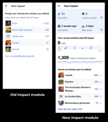
I assume this is about the update we made to the "Your impact" module on the homepage, correct? The image here shows an example of the previous design and the new design.

One downside of the new design is that the Total edits count is capped at 999+ for editors with over 999 edits. However, we plan to fix that, and we'll work on the improvement ASAP based on your feedback. Here's the task:T338174: The impact module should display the real numbers instead of capped numbers

Basically many of the metrics on the new Impact module (like the Thanks received count, Best streak, etc.) are being calculated for the new Impact module, and needed to have some sort of reasonable cap. But the "Total edit count" is a metric that we don't need to calculate, so we can start showing the true total rather than the capped metric.

Do you have any feedback about the other changes? Are any of those other metrics interesting or helpful? Are there other metrics or data visualizations that you wish were included? Thanks again for the feedback!

Iljhgtn (talkcontribs)

thanks. thats all that i was hoping for was not the capped 999. have a great night.

Iljhgtn (talkcontribs)

just maybe put the true total at the top of the module too and not at the bottom. it helps to be able to see it really quickly at a glance.

KStoller-WMF (talkcontribs)

Thanks for the response!

Yes, the true total will display at the top of the module once we make the update. Actually it looks like that image I shared has a slightly older design, as we no longer show the total edit count at the bottom too.

A Growth team software engineer worked on the task today, and hopefully by next week you'll see the fix on your homepage. Thanks again for providing feedback, and for your patience as we make improvements.

And please feel free to let us know if you have any other feedback about the homepage. Thanks!

Iljhgtn (talkcontribs)

this is really responsive. i had no idea that the wmf was so responsive and helpful. i would love to make more suggestions at some point. where is the right place to do that?

KStoller-WMF (talkcontribs)

@Iljhgtn If you have suggestions about the Newcomer homepage, then this Talk page is the place to do it. :)

If it's about editor onboarding or features meant for newer editors, the Growth team would love the feedback! Talk:Growth is probably our most active talk page, but you can post a message on any of our team pages and we'll be sure to respond.

We can't always take immediate action on community feedback, especially if it's about a larger idea or feature that we aren't currently working on. But we love to receive suggestions and ideas from newer editors, and we'll always respond. If we can't prioritize the suggestion, we can always document the idea for future consideration.

If you have suggestions that don't relate to the Growth team, we can always direct you to the correct team, or you learn more about each WMF Product team here: Wikimedia Product (there are also Wikimedia Technology teams and many other departments within WMF: Wikimedia_Foundation_departments).

Thanks again for taking the time to send us feedback about the newcomer Homepage! We've been discussing ways to make the Homepage more useful as editors progress and get more familiar with the wikis. I hope that eventually the Homepage can be personalized and have tools for more advanced editors and patrollers. So definitely let me know if you have any feedback about what would have helped you out as you were getting started or what features you wish were introduced on the Homepage earlier (Wikipedia Library, Patrolling, WikiProjects, Edit-a-thons and Wiki events in your area, etc.).

Iljhgtn (talkcontribs)

i like the newcomer homepage overall, and plan to keep it forever if i am allowed to. it is very helpful as a launchpad to being productive on wikipedia in the morning.

KStoller-WMF (talkcontribs)

You will definitely be able to keep the newcomer homepage enabled indefinitely, and I'm so glad to hear that it's a good launchpad to being productive!

Iljhgtn (talkcontribs)

i have not seen the change go into effect yet. is that happening soon?

KStoller-WMF (talkcontribs)

@Iljhgtn Sorry for the delay, the Impact module change will be visible by the end of the day on Thursday.

It looks like the patch has now been merged, but you won't see an update yet because Mediawiki changes are released via a Deployment Train. That means that you can test changes on beta Wikipedia and test Wikipedia today (Example of the new impact module on beta Wikipedia). But the change won't be visible on English Wikipedia until Thursday. Sorry for the delay, but the deployment train schedule helps ensure we have time to test changes before they are released more widely.

Iljhgtn (talkcontribs)

thursday is great.

Iljhgtn (talkcontribs)

i checked and it has not yet been updated. it is now friday where i live.

KStoller-WMF (talkcontribs)

Oh no, sorry, I goofed. It looks like the code was merged after the release train cut-off last week, so it will be visible on English Wikipedia next Thursday (November 16th). For urgent fixes, there is another backport process we could have followed the get the change out sooner, but it takes more engineering time to schedule and attend the backport windows.

I still find the release train schedule confusing, sorry to mislead you!

Iljhgtn (talkcontribs)

thank you for updating me.

Iljhgtn (talkcontribs)

so it should be today then correct? i still do not see it. i only see the "999+" still in my homepage in the top leftside uppermost box.

Tacsipacsi (talkcontribs)

It should become (and not be!) correct over the course of this day. And it did, around 7pm UTC; I now see my total count on enwiki (which is over 1,000).

Iljhgtn (talkcontribs)

this is it. good work whoever made this happen!

KStoller-WMF (talkcontribs)

Hurrah! Sorry for providing a misleading timeline initially.

Thanks all goes to @Martin Urbanec (WMF). Thanks, Martin!

And thanks again, @Iljhgtn, for providing feedback!

Iljhgtn (talkcontribs)

glad it was done. it was still pretty fast.

Iljhgtn (talkcontribs)

Looks like someone moved my cheese again!

Iljhgtn (talkcontribs)

Is there a way that I could customize the newcomer homepage to not have the "suggested edits" window? I like the "impact" window a lot, but it is no longer near the top of the page and was moved down so now i need to scroll down the page.

Iljhgtn (talkcontribs)

This is not a significant problem, but it was another change that I did not ask for.

KStoller-WMF (talkcontribs)

@Iljhgtn Sorry for yet another frustration! The Growth team hasn't changed anything that I'm aware of that would have caused this... I might be jumping to conclusions, but I'm wondering if the layout change relates to the "Accessibility for Reading (Vector 2022)" Beta feature that is being tested by another team currently. If you disable the beta feature (via Special:Preferences#mw-prefsection-betafeatures) is the layout back to what you expected? Or can you just hide that "Tools" side panel? If that doesn't help, can you provide a screenshot so I can help troubleshoot?

As for totally disabling the Suggested Edits module on the Homepage, that's not currently possible but that's something the Growth team has discussed before. Ideally eventually there are more modules on the Homepage and they can be customized and disabled/enabled based on personal preferences. I've just added a task to represent this work: T353301. I'm unsure when that work can be prioritized, but it is part of our long-term vision for the Homepage. Do you think this would be helpful? What other information or tools would you like to see on your Homepage?

In the meantime, @Trizek (WMF) might be able to suggest some CSS to hide that module. Or you could navigate to https://en.wikipedia.org/wiki/Special:Impact/ to see only your Impact module.

Iljhgtn (talkcontribs)

i like the setup, but i like being able to add or subtract modules/windows from the homepage. i like the impact part the most. that lets me know how i am helping build wikipedia and makes me feel good. :)

Reply to "old newcomer homepage!"

999+ edits on Special:Homepage

2
Msz2001 (talkcontribs)

Hi! The edit counter on the homepage is used also by some of the established editors (as it's easier to discover than the one in preferences). However, after a recent update of the homepage, the counter was capped at 999 edits, rendering it unusable for experienced editors.

Would it be possible to get the exact number back?

Trizek (WMF) (talkcontribs)

Hello, and thank you for sharing this idea with us! :)

We went with the idea of 999+ for two reasons:

  • our primary audience are newcomers,
  • we have database query issues to get all numbers.

We are currently wrapping up our work on the impact module, which means that we won't change many things on this new impact module any time soon. I documented your request, as it is something to consider; Impact module usage by established editors is not something that was part or our initial plan.

Reply to "999+ edits on Special:Homepage"
Sunpriat (talkcontribs)

@MMiller (WMF)@Quiddity@Trizek (WMF) As the new user reports , in MediaWiki:Growthexperiments-tour-welcome-description-d, he did not understand what phrase "see your impact" at the end was about when he saw the message in the interface. He asked to make this phrase more understandable for someone who sees it for the first time. Perhaps it is worth making the original en-text a little more descriptive, otherwise mentioning only the name of the module weakly represents its real function.

KStoller-WMF (talkcontribs)

Thank you, @Sunpriat for passing along this feedback! We are working on some improvements to the Impact Module soon, as part of the Positive Reinforcement project, so this is well-timed feedback.

Just so I'm clear: this feedback is about the "Your impact" language on the newcomer homepage, correct? Do you think it's definitely the English copy that makes this confusing, or is "impact" a term that doesn't have a great equivalent translation in Russian? Please let me know if you have a specific suggestion for improved language.

We just ran several user tests with newcomers that included the Impact Module, so I'll also follow up with our lead researcher to see if this also came up in user testing. Thanks again for the feedback!

Sunpriat (talkcontribs)

@KStoller-WMF As for the feedback, it refers to the text MediaWiki:Growthexperiments-tour-welcome-description-d in the pop-up message. When you open the home page for the first time, this pop-up message appears. When a participant (who does not know anything about the module yet and has not seen it) reads this message for the first time, he does not understand what is being said here. If you look at the home page, there is an explanation "Views since you edited" under the module header and this allows you to correctly understand the meaning of the word. But the message seems to cut off the phrase. For example, if it were written "and you can see your power", then the question arises what type of power it says here. The participant read this message as "your actions", probably as a shorter but beautiful representation of the "Special:Contributions" (there is even a link to it at the bottom of the module). It would be clearer if the phrase were continued and concretized. For example, "and see your impact on pageviews", "your impact on the popularity of articles", "your impact on the frequency of article reads".


As for your question about translation - yes, it's also not very good here. In translation, we have two variants "wiktionary:влияние" and "wiktionary:воздействие". They are understandable in the context of a phrase or paragraph. But in a short phrase or seeing one word, the situation is such that this word is associated with a more common meaning - as if there is "influence", for example, "your influence in a group of people". (If you look at the translation in the opposite direction , then the main (first value) is also shown "influence". And auto-translators will translate it in the first place that way.) The module shows an improvement in metrics. This word does not represent the reference to metrics and pageviews improvements very well. I have no idea which module name would be better. (Maybe using the forward and then the reverse direction of translation in auto-translators will give you a fairly good idea of what meaning for words people understand first when they read some title.)


By the way, it would be useful to have a link to the help on the mediawiki page mw:Growth/Personalized first day/Newcomer homepage#Modules, which describes the functionality of all modules. Your understanding of the homepage when you read the descriptions on the help page (or forgot, but you can easily find this page again and read it again) and understand the purpose of the modules is quite different from the understanding of the participant who saw only the final interface without those descriptions.

KStoller-WMF (talkcontribs)

@Sunpriat thank you for the detailed explanation! Yes, I can see how a newcomer might be confused by that language. I'll chat with our designer to consider if alternate copy is needed.

Even if the English copy doesn't change, would it be possible to just add slightly more context to the translation? So rather than a direct translation of "see your impact", the translation could be for "see the impact of your edits" or something along those lines?

And I'll also chat with our team about your suggestion about linking to the help page from the homepage. I think ideally the homepage is clear enough that linked documentation isn't needed, but that's an interesting idea.

Thanks again for passing along info, and for being a great advocate for new editors!

Sunpriat (talkcontribs)

There is an article w:Impact factor - this title (which already has translations into other languages) could be taken as a basis and called the metric "wiki impact factor".

Reply to "Newcomer's feedback"

How does the mentor thing works?

2
Paper9oll (talkcontribs)

So I frequently update my preferences and also browse around it to see any new changes/features on English Wikipedia, I happened to came upon this "Display Newcomer homepage" checkbox so being curious I ticked it, and going to my homepage (via the link displayed left of userpage), I noticed there is a mentor thing so I read around about it and it is designed obviously for newly registered user since it's called newcomer homepage and the mentor are assigned randomly ... but I'm certainly not a new user since joining 8+ years ago and has accumulated approx. 30,000+ edits so why do I even have mentor?

Trizek (WMF) (talkcontribs)

For practical reasons, we have assigned a mentor to everyone. We plan to work on a feature to opt-out mentoring.

Reply to "How does the mentor thing works?"
Kyykaarme (talkcontribs)

I've been translating the Homepage feature on Translatewiki, and I noticed that there is an option for the user to view the impact module of another user. Does this mean that anyone can see another user's "impact article list", and is it possible already now or only in the future, and does the user have any control over who can see their list? And what's the thought process behind a public impact module?

MMiller (WMF) (talkcontribs)

Hello @Kyykaarme -- thank you for working on translations for the Growth features! I know there's a lot of text in them (because there's a lot to teach newcomers), and so it's really helpful that you're spending time on it. Good question about the "Special:Impact" page. We originally created this page because it helped us QA and troubleshoot issues with the Impact module, by allowing us to validate that the module looked right for many different users. We've kept it on because it continue to be useful for troubleshooting, and it doesn't display any information that's not already public. Here's a Phab task where we considered turning it off, but ended up not doing so.

It sounds like you think users may not want other people to be able to see their module so that they and their work can remain more private. Is that right? What are your thoughts?

Kyykaarme (talkcontribs)

The Homepage contains information that surely is private (email address) and I wouldn't think that anyone should see what my topic interests or preferred difficulty levels are. It's then natural for me to think that everything on the page is visible only to me. If some parts of the page are not private, I would like to at least know about it. And I especially would think that if I were a new user.

I don't know what the effects of the impact module are on new editors, maybe they really like it, but I could see also some negative sides, such as seeing very low views for your articles or having had unpleasant editing experiences (getting reverted and/or admonished) and then seeing those articles every time you go to the Homepage. Maybe there could be an option to hide the list, so that one can look at it once in a while but not have it there at the top constantly.

I would actually like a Homepage where you can pick and choose the modules you want to see and remove/hide the ones you don't have use for. The suggested edits "carousel" is a cool tool, and I could see it used by experienced users as well (without the editing tips). It's a lot easier and more fun to click the carousel than to browse categories when you're trying to find interesting articles to edit.

Reply to "Public impact list?"
Quiddity (talkcontribs)

[A tangent from the other topic, "Engagement" page, which I don't want to distract from...] [Preface: I love some of the ideas in the Newcomer homepage project. These are supplementary thoughts.]

Someone asked me recently:

> Whilst I was just a volunteer, what could Wikimedia (movement/foundation) have done better to make me feel I could grow?

I replied: "In a word, userpages.

The way that some editors use their userpages is fascinating. They use them:

  • to track their to-do lists,
  • to store notes and wikitext/snippets/citations they're using a lot (for easy copy&pasting),
  • to list their accomplishments and accolades,
  • to organize (and share) their bookmarks,
  • to disclose their COIs,
  • to write short autobiographies,
  • to list their passions or affiliations (often in the form of those small 'userboxes'),
  • to write essays and rambles,
  • and more.

My Enwiki userpage has always been the first destination of the day for most of my volunteer activities - it loads faster than the watchlist, it contains my links to watchlists on other projects, and it contains my most frequently used bookmarks/snippets. I typically leave it open in a tab whilst I do anything else on the sites.

I've long-thought that there are some good ideas that could be extracted from the previous WMF research into userpages, to help both simplify & power-up the default experience (which is fairly-to-extremely complicated for non-technical people - and the English help docs (stuck circa 2007) are frankly terrifying).

I.e. The previous research included ideas such as automated boxes of statistics about the editor - I think many existing users would really love this. If we could provide that kind of thing but in the form of normal wiki Templates that would fit into the classic freeform pages (thus making most existing users happy), then we could potentially also offer an easy "create your own userpage from these few predefined skeletons" wizard system, which editors could then use normal page-editing to re-arrange and personalize, and thus make everyone happy. [!!]

Here are the 2 old WMF research projects (which never made it past the mockup or notes stage)

TL;DR: We should help newcomers to use their actual userpages in ways that work for them (diverse ways for diverse people). Not a one-size-fits-all-solution (I think the GlobalProfile mockup idea was inherently flawed by its standardization approach), but give them help in finding the possibilities.

Because: Having a good userpage - especially one that is actively used, and can become their first browser destination for daily editing - can give editors a sense of personal connection to the sites, and also provide a space for an individualized (and sometimes 'humanized') element that can help people to relate to each other.

Wakelamp (talkcontribs)

The User pages look like GEOCITIES on a bad day :-) They are multipurpose - Who, What, achievements, likes, and the categories don't actually lead to any community interaction. I think boardgamegeek does this best, especially as some of the achievements are assigned externally.

I am having similar thoughts though about the home and main page, except that I think the Main page should be personalised for non anonymous new editors as a reward.; anonymous editors should see a a registered editor only block and a warning that anonymous is not as safe as registered :-)

Non-active editors need prods to return, visibility of a cohort, main projects , and their mentor contact .The emphasis should be things that build a healthy community - giving and receiving thanks, taking part in topics that are marked for archive that have not been marked as conflict by more than one person etc

The focus on Number of edits is unhealthy, and is gamed by BOTs. and older editors who do the 20 % of typing that generate 80 % od edits

We also owe a duty to editor to show much time they have spent on wiki this week - burn out is very bad/unsafe for wikipedians as others don't know it has occured as they just don't login. I have no doubt that others behaviour contributes to mental health, because some editors just see others as NPCs :-(


VISIBIILITY - Have a personalised main page for non anonymous editors to reward editors.

ViSIBILITY - CURRENT MAIN PAGE

- Far more than 5 to 7 items on the pages, so most of the main page is just skimmed as there is too much information.

- The left pane takes up a huge amount of real estate. is used by the minority, and should be move to an info tab

- A single featured article is ok, but you have to page for the featured picture,

- News is OK, but there should only be one item showing.

- The sister projects etc are irrelevant, and should be collapsed or just a feature project with a few lines.

-  The Adverts for projects shouldn't list the articles that work has to be done on (scary) It should give what people enjoy about

VISIBILITY - PROPOSED - The top right , have a welcome with Number of edits,  Which of your edits has the most views, number of edits, thanks given, received, tasks closed that did not involve conflict , number of hours editing this week - changing colour to help mental health, blah blah and mentor contact if gets too high

Similar for the thanks received by your cohort , Your mentors name, Achievements of your projects today The featured picture next to your name. I think the resistance to having an avatar is generational


NUDGES are Personalisation,  pride in a community, community spirit, support, incentives for good behaviour


Overall, Wikipedia is unwelcoming in part because experienced editors assume that the heroic days are over as we have all the pages we need. They see no need for new admins, or changes in policies, or in systems, or for new editors The decision by consensus often ends up being rule by the loudest or by experienced editors

But the Experienced editors are wrong.

fI you add up unanswered talk, maintenance tags, article tags, dead projects, lack of references, categories, and article quality then we probably have 30 years to go.

Reply to "Userpage as Homepage"
Wakelamp (talkcontribs)

We need new editors because there are huge backlogs in many areas. We also need them to focus sometimes on those edits we need fixed

I think users retention could be increased by Excitement ,Community, Available Support, Clear procedures, Safe Spaces, and Visibility of achievements .

Wakelamp (talkcontribs)

I have split the areas into sections to avoid wall of text and to allow people to comment on eacg

  • EXCITEMENT
  • - When you do your first edit, you are greeted with a plain page asking you to choose between anonymous ( but not advising that being an Editor gives better anonymity) , or becoming an Editor. (Are there statistics on how many possible editors stop here??). Instead maybe - A featured picture associated with the project the article is in, And the mentor for that months reasons they like wikipedia - A welcome message advising that they will be asked to join New Users of November 2021 and asked to join a project community. B - Options to join an active groups that you share a trait or int with maybe are an ally women, trans, nationality, profession, same age group .
  • Scary large Article and stubs (which i think default as hidden) also have an encouragement to become an editor . These are high friction because of size, colour, no mention of rewards, position, and imply self sacrifice and accepting a fault. Instead It would reduce friction, if non-readers could become an editor before hand. prompted by a single line hopefully occasionally humorous or appealing to diversity. Let the messages decided by different A/B messages, only appears for non-editors.
  • These are all good nudges as they split friction, reduce friction, have a clear call to action, recognise, external group memberships, eye candy, clear focus, inspiration,and short term reward. A long term group intangible reward (A template saying they have x active more editors than the average or they have more happy editors etc, or least open talk issues ...)
Wakelamp (talkcontribs)

COMMUNITY - I think the core to retention is community,

  • Welcome

After a New Editor publishes their first edit, have a congratulations screen that gives them a choice of active communities to join based on their edit or via a wizard, and also automatically assign them to say "Novermber 2021" and ask them to post about their interests. A month should be small enough at 5 % active to make a community.

  • November 2021

- Assign mentors, and automate a monthly group talk topic

- Criticism messages (Reverts and speedy deletions) are also sent to November 2021 (Have you any advice/support/help to fix for... ) with the critics name as a link, so peers can learn. and Mentors can say whether it is fair and discourage edit wars..

  • Editing Topics

- Unpleasant interactions destroy communities. Most is unreported Experienced editors with high edits have support communities, so are forgiven because they are busy. We need junior editors as they mostly create content, while many experienced editors however use automated tools to fix minor issues Workaholics also reduce output because of hogging glory or resistance to change ; with wikipedia they can reduce active editors.

- I suggest that talk topics have option to escalate, or create an FAQ , or mark for archive and that the talk tab have a number of open tasks and change colour based on the number of editors escalating. Editors showing number of escalations caused and thanks world be cool as a rollover There also has to be a better way of getting hellp for people rather than tagging WP:NOTTHERAPY.

  • New Editors

New editors are supposed to be treated nicely, but finding out whether they are new is a multi-step process. A tag next to their name would nice.

  • Create an Article

- You allowed to make your first page after a few weeks/edits. You will fail :-)

- There is a new page wizard , but it isn't major category specific (so precise notability criteria can't be checked or whether enough allowed sources are used. A classic example is IMDB is disallowed as a reference: IMDB important categories are maintained by the industry using IMDBPro, it is used on Box Office Mojo which is allowed, and it is used by reporters, Ideally there would be automation to check and give a percentage complete - but the automation is all on the NPR side.

  • Monitoring new articles

- This is very low friction for tNPR, but as a genuine new editor it took me about 4ish hours to create my first article,

- NPR can mark an article for deletion and assign a big yellow tag of New Editor failure in 1 minute. If it goes to AfD it takes about 5 to 10 minutes of NPR editors discussion time to delete a page. | The AfD discussions are legalistic and cold and the New Genuine Editor often rage quits. AfD need to be like this because of scammers and notability issues, but some of the notability requirements are rusted. If enough people are searching for an article that fails our criteria we should consider changing.


Nudges are small community within large, available support, peer support, Mentor support, group learning,protections organisational renewal through strong peer links in Junior Editors, and clear procedures..

Wakelamp (talkcontribs)

HELP - They get peer support above, but also get told who there mentor(s) are with a template with a nice image and a summary of who their mentior from a template on the mentor page. As soon as they get autoconfirmed, they get a message from their mentor saying contact them to discuss if they are thinking about creating a new article.

Wakelamp (talkcontribs)

PROCEDURES and TAGS - They are frankly overwhelming. On your first day you come across them in 3 ways.

PROCEDURE - ARTICLE - At the top of Article are on scary anonymous judgmental un-collapsed uninformative tags, maintenance tags are in the body, and stubs are at the bottom (although hidden for new I think) Mostly they should be on Talk rather than Articles (but people don't check Talk, and tools don’t update it.

·        Reader View- Complicated Tags with very old dates reduce trust, even if the issue is minor. The real estate also emphasises that editing is more important than content, criticism is more important than creation.

·        New Editor- First day and they are going to edit. They go to a page covered with tags. They are overwhelmed with the procedures, and they decide to do their first edit to fix the tag.

-         The New Editor reads they should try and get consensus, so they add a Talk topic. No one ever responds as no one is watching the articles (and they don't know the article is unwatched), and no one looks at the talk tab, The New Editor expect a quick response, and they stop when they don't get one. They decide to wait till they get a response.

-         The New Editor can’t find the issue, so they feel shame. The reason they can't find it is another Editor has fixed the issue, and not updated the tag or looked at Talk. They get worried about their ability. They quit.

-         Full of excitement they decide to edit and be brave. Their edit is re-verted. The Editor reverting does not know the person is a new editor, adds WP:Shortcodes, is unpleasant, leave a cryptic comment, or complain they should have looked at Talk or even Talk Archive. The New Editor rage quits.

PROCEDURE TALK

-         Template header is BIG, has many warnings relevant to the article, or experienced editors (be nice and don't bite newbies), but only one action. It's not clear what to do and the links to large, complex procedures. New Editor quits as there seems to be lots of rules.

-         \Project headers -are Freudian in their size, are Pseudo-Article categories or projects recruitment ads, are relevant only to projects, and not editors. Projects don't monitor open topics in their projects, and there is no indication you should ask them for help. Experienced editors ignore them, but it still increases friction as they have to page down.

-         The Sanctions tag is just scary, un-collapsed, not differentiated in colour or position, links to procedures that even more complex and scarier, appears as a Notice as well, and is mostly relevant to the Article. With all the warnings, Wikipedia just got scary. New Editor Quits

PROCEDURE - TALK POST

- a New Editor creates a topic, but it's as the bottom. They assume (often correctly) that no one will ever look at it. Even if an Article is highly viewed, about 20 % of topics never get checked and it is archived. When a New Editor as soon as 10 days , their topic is archived, but they think it has been deleted. Their first day as an editor was wasted. The New Editor quit.

- Someone does look at it. The replying editor does not know it is a New Editor,. The new-Editor receives a reply full of short codes WP:NPOV or WP:NOTTHERAPY . These procedures have a low readability .Tooltips showing the Nutshell might help. But Nutshell is a workaround on procedure readability, and the main procedures have lots of things that it is all about consensus. Unfortunately consensus can sometimes means that more experienced Editors can override the New Editor, based on precedents that are not recorded. The New Editor quit.


Suggested Changes

-         Normalisation of screens - Article Tab has only Article information, Task Tab only has task information, Page information has page.

-         Tags should be on talk, but as posts with the Editor who added them.

-         Tasks can be marked as important and Escalation needed/conflict. This should change the colour of the the topic heading if more than open person clicks it

-         The Talk tab should show the number of non-archived tasks, half of it should change colour for conflict and the other for importance

-         Make tags appear on Talk. They can still show as a single line of codes on Article, but controlled by Talk not editable.,

-         Change article publish to show as list of open tasks. Editors can select one or more tasks, and choose to update with their publishing comments or mark the topic for archive It would also stop New Editors from not knowing about tasks TA

-         We have a ranking system for pages already, so if we used that and maintained NPR/Twinkle created comments/tags on Talk it might work better.

-         There is no incentive to mark Talk Topics for archive. New Editors would find the process of using HTML at front and back confusing, The measure of success on Wiki is edits. Measures should be in place for editors on thanks given or received, RfD, Tasks taken part in an archived, Number of mentor posts. This should be an info tab that all editors can see

- Number of watchers should be visible to all non anonymous editors, The rationale was that vandals would attack unwatched screens. But they attack watched screens


Nudges

Nudges are lower friction, minimisation of keystrokes, clear instructions, remove focus from  # of edits as status, normalisation of screen purpose, warning colours, Visibility of open work, feedback loop on cohesive behaviour, Reduce perceived issues, Visibility of inexperience,

Reply to "What retains editors"

"Your impact" module thoughts

4
Sdkb (talkcontribs)

Hi Growth Team! Having glanced at the impact module a bunch since activating the homepage, I just wanted to offer some thoughts on it.

First, if new editors feel at all similarly to how I do, this module definitely seems to be succeeding at the goal of helping editors feel satisfaction about their impact. The main way you normally find out that others have seen your edits is when they get reverted, and this is a lot more pleasant than that haha.

Second, this is probably something that's a lot more acute for me as an experienced editor who edits tons of different pages than it would be for a newcomer who hasn't edited that many, but the selection of pages still seems off. It feels very heavily weighted toward pages I've edited recently (which have less views since I edited them by virtue of being recent), and sometimes pages I've only made quite small edits to show up. Adjusting the algorithm that picks which pages to show to favor ones where I've made large or many edits and place less weight on ones I've edited most recently might help.

Third, I think a likely impact of this module to consider is that it pushes editors toward editing more popular pages. When I see that 100 people have viewed my contributions to one page and 5000 people have viewed my edit contributions to another, that's a strong push toward editing the second page. If that's the case, the upside is that it'll allow their contributions to benefit more readers, and that it'll increase their odds of coming into contact with experienced editors who can help them if needed. However, the downside is that many more popular pages are already in much better shape, so they may have a harder time finding positive contributions to make, and the editors they encounter may be as likely to revert or bite them as to help them out.

Nick Moyes (talkcontribs)

I also had similar concerns about pushing new editors towards popular articles. The upside of that is that there would be more oversight of these new edits. If the algorithm were to be slewed so that it reflected the ‘’proportion’’ of the article that was altered, then a change to a stub article would look better than a similar edit to a large, popular one.

MMiller (WMF) (talkcontribs)

Hi @Sdkb and @Nick Moyes -- I'm sorry I missed this thread when you created it, but I'm glad you posted your thoughts. It's true that we the rules for displaying the articles in the impact module are geared toward brand-new users seeing the most impactful of their recent edits. We wanted them to have the moment of, "Wow, people are actually seeing what I've done!" If you're interested, you can see the actual rules it's using in the original task (which also contains a brainstorm of possible improvements).

"Among the set of 10 most recent pages that the user has edited, choose the 5 pages that have the most pageviews since the user first edited them (or in the last 60 days, if their first edit was more than 60 days ago -- because of constraints of the API). If a user has edited a page multiple times, their most recent edit of that page is what is counted for deciding whether it is part of the 10 most recent pages. For this sort, "null' sorts below 0 pageviews. If the user has edited fewer than 5 pages, show them all. Display those 5 pages in descending order of pageviews."

We have improvements planned for the module this year, and this is our nascent project page related to the work. I think an approach that would get at what you're saying is to add options and filters to the module, e.g. letting users select "most views" or "most recent" or "largest changes by bytes" or "exclude minor edits", and let those selections be sticky. What do you think of that idea?

Sdkb (talkcontribs)

Ah, thanks for the explanation of the algorithm! I think the thing that's making the selection feel off for more experienced users is the "set of 10 pages" part. I'm not sure how costly this would be in terms of API, but an improvement would be to look at the set of 50-100 most recent pages to which the user has made non-minor edits.

Reply to ""Your impact" module thoughts"