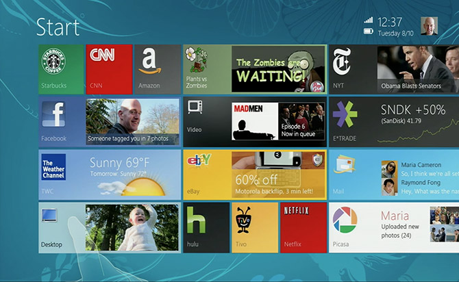
A friend recently forwarded me a MetroTwit for Windows 8 cameo in a UX Week 2012 presentation by Microsoft’s Jensen Harris from the Windows design team. Watching through the entire presentation, I noticed that Jensen showed off something I’ve never seen before – early mockups of the Windows 8 UI.
According to the Fast Company profile on Windows 8’s redesign, the first mockups of Windows 8 in 2010 (a year after release of Windows 7) was codename “Pocahontas”. In Jensen’s talk, he reveals the mockups (below) were used at an internal “vision day” to unify the vision of all designers within the Windows team.
Without further ado, here are the early mockups of the Start screen (above), lock screen, charms, Snap and soft keyboard.
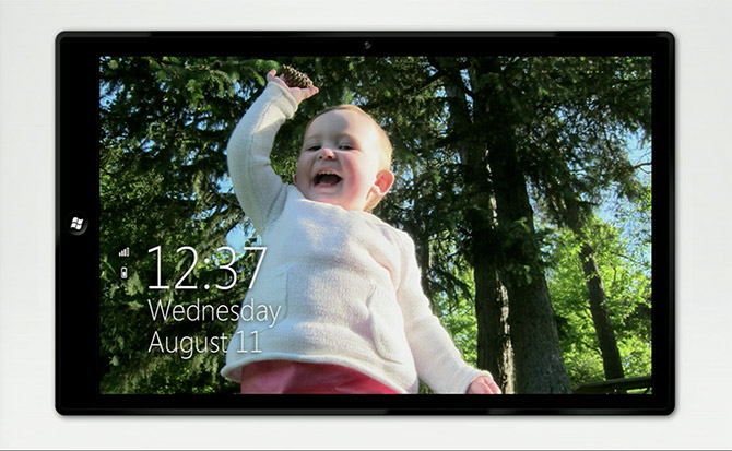
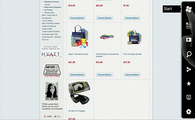
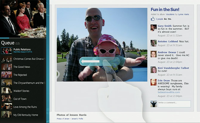
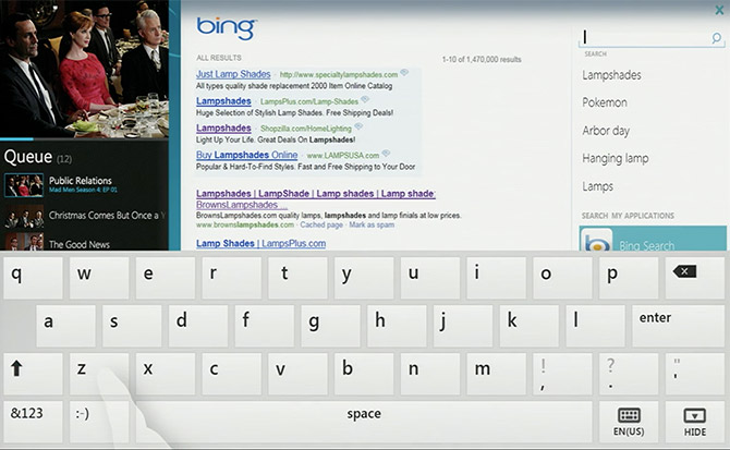
Although I can only assume this is just a tiny sample of the entire mockup set, it’s interesting to see just how little (ex. the lock screen) and how much (ex. charms icons) the early ideas have changed. Even many of the fundamental elements of the Start screen remain unchanged since all the back in 2010.
And just to put things in perspective, the first iPad was released in 2010.

Pretty and less usable, less useful. Works for Apple, may not work for Microsoft. And it will be re-imagined again and again.
works for apple , all i see is i am a troll and like to bash apple with no proof what so ever
All I see is a person with limited abilities who gets scared by more advanced features which just cannot be added while still keeping it overly simple.
Yes, please Microsoft, don’t stop reimagining! Hurry!
I really miss clock on Start Screen
Agreed. A clock should always be present on a mobile phones and tablets… even if it’s only a little thin bar at the top.
there are plenty of app tiles made specifically for displaying the time
And Websites too.
Really wish they had left the text shadows on the lockscreen, can be difficult to choose the right background for it because of that.
these mockups are more beautyful than the final product. I like Windows 8 and use it daily but the flatness of Metro is just extremely ugly. Even the squared windows frames in Desktop mode are totally ugly. And the icon mishmash of Metro apps and Desktop apps is just horrible wrong. So : a fantastic OS, as it has extremely good performance and many under the hood tweaks, nice new features like filehistory and the new Explorer, I even like some of the available modern apps, but the way MS has stitched this all together and how they made it all that ugly is just frustrating. Somehow the “final” Win8 feels rushed out, not quite finnished.
I am just not thrilled with Windows8. Not at all man!
http://www.Go-Anony.tk
Windows 8 has it wrong with this NO CHROME approach. Windows has always been about giving users options, but not this time. This full screen mode has resulted in wasted space with huge blocky rectangle with sparse content. The clock, battery indicator, wireless signal should always be visible and should rotate with the UI when the user changes orientation. You just can’t force everything into full screen mode. There are many use cases when you’re in an app and would like to always view the time; Overtime, they will have to realize that they gopt some things right and a lot of other things wrong.
I also find this horizontal left to right scrolling of content when using the mouse really annoying..especially with the ugly scrollbar…like the ugly context menu in WP8. The eyes swing trying to read left to right because everything else flows top to bottom. The should be different UI templates instead of forcing developers to design their app with these huge blocky rectangles that scrolls left to right…What’s wrong with the original UI paradigm of scrolling top to bottom? Enough of this rectangle…all the apps just look similar and there are no differentiation…
Windows 8 ist just pretty useless. And I am saying this while my purchaes upgrade copy has been installed in a virtual machine to get me used to it. But no matter how hard I try, it does not work for me. So many things must be tweaked before you can really work with it. But even then there are so many annoyances where Microsoft has chosen not to make things optional for the user that I just don´t want to get used to it.
I have a perfect set up system and I don´t want to retrain my computer usage to learn about clouds and apps and shortcuts and swipes only to see that there is not much more that can´t be done with my actual system.
For me Windows 8 was cheap. But it was a fail.
I read your comments and I realise that you get it all wrong. The Modern Windows is not about mouse! It’s not about desktop with menus at all! It’s about TOUCH! You whine about ugly desktop windows – that’s a legacy thing! You will forget about the actual windows as a whole in the next 5 years. You will throw away your mouse because you won’t need it anymore. Imagine the future where all you need is a screen (and a keyboard for Office and other big writing stuff). And you use that screen with your fingers! Once proffessional software makers release their products for the Modern Windows with TOUCH in mind, you will laugh at the past when you had to move a mouse to point the cursor on a tiny little menu to get something done. We still do it but it’s getting old. It’s like a manual transmission. Some people still drive stick but everybody knows that automatic is easier and more convenient. That’s what the new Windows is about. But Microsoft decided to do this transition slowly by keeping the desktop. Now that was a mistake. I think they should’ve just release a SP2 for Windows 7 with all the new desktop features of Windows 8, and then announce Modern Windows (which they call Windows RT – I guess) as the brand new OS. And right now it’s up to Adobe, AutoDesk, Avid, Corel and other major software companies to make their products right for the future with touch in mind. It’s a brand new era of computing! You people should embrace it!
u Since reading this blog article, I have always wondered if anybody who contributed to Long’s Windows 7 Taskforce website secretly knew about this Windows 8 mockup!
Using a touch interface doesn’t work on a desktop. The so called modern Windows UI is not appropriate for that usage environment. Period. It is a ergonomic nightmare for a vertical screen leading to arm and shoulder strain.
The deployment of big clunky blocks that you need for a touch environment is not appropriate for a large screen.
The single working window also conflicts with the way people work.
Windows 8 as it stands currently is a consumer O/S not fit for serious work.
The mockups of the start screen look much better then the actual implementation. Every tile with it’s own icon, name, dynamic content and beveled edges looks awesome and are easy to diifrentiate. I hope this look and feel will be implemented in next release.
Very interesting. Now we have 2013.
In my opinion is Windows 8 not the best product by Microsoft.
We wait for Service Pack1. My be it will be better.
I hope so. It will be better.