Pick a color
Bring it to life with Figma
Jumpstart your designs with your very own custom color palette.
Color plays a valuable role in our daily life: it conveys feelings, changes actions, and influences every element of how humans view the world.
Imagine you’ve poured your heart into crafting a beautiful, captivating design. You've nailed the layout, the typography feels just right, but something feels off. The colors just aren't clicking.
In the world of design, color choices are not just about aesthetics. Color can guide viewers through your project, evoke emotions, tell stories, and, ultimately, create an experience. Choosing the right colors can make the difference between a clear, engaging project and one that leaves viewers confused or disoriented.
But with a vast spectrum of colors at your fingertips, how do you ensure you're picking the right ones and combining them effectively? Enter the color wheel — a timeless, powerful tool for crafting harmonious color palettes that elevate your designs every time.
The color wheel is a simple but powerful tool that helps designers make decisions about color, create schemes that resonate with audiences, and achieve specific design goals. The circular diagram organizes colors based on their relationships, categorizing them into primary colors, secondary colors, and tertiary colors, illustrating how they transition and blend. Designers use this visualization tool to understand color interactions and create harmonious color schemes for digital projects.
Sir Isaac Newton invented the color wheel in 1666, laying the groundwork for modern color theory. His curiosity about light led him to experiment with passing white light through a prism, separating the white light into a spectrum of colors. This phenomenon inspired Newton to arrange these colors in a circular format, creating the first color wheel. This ingenious diagram demonstrated how colors relate to each other and established a systematic way to understand how they interact and blend. Sir Isaac Newton's color wheel remains a foundational tool in science and art.
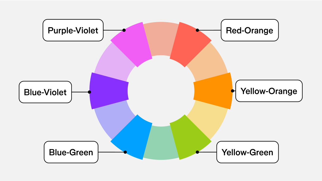
Typically, a standard color wheel includes 12 colors: three basic colors (red, yellow, blue, known as primary colors), three secondary colors (orange, green, violet), and six tertiary colors (red-orange, yellow-orange, yellow-green, blue-green, blue-violet, red-violet).
Advanced color wheels incorporate a broader spectrum of tints, shades, and tones for more nuanced color design—especially useful for digital and UI design. This expansion gives designers more precise control over color selection, facilitating the creation of complex and refined color themes and palettes.
Using a color wheel is a simple and effective way to create a compelling and cohesive color palette for any project. Here’s how to do it:
Step 1: Choose a base color.
Use the color picker to select a base color on the wheel. This color will be the foundation for your color palette, setting the tone and mood for your design and influencing the selection of additional colors.
Step 2: Select a color scheme.
Select a color scheme. Each scheme offers a different visual impact:
- Complementary gives you maximum contrast by using colors directly opposite each other.
- Triadic creates a vibrant yet balanced look by using colors in a triangular formation.
- Analogous produces a harmonious effect with colors adjacent to each other.
- Split-complementary delivers a high-contrast look with less tension, using the base color and two adjacent colors as the complement.
- Square enhances diversity with four colors evenly spaced around the wheel.
- Monochromatic harnesses the power of lightness (tints) and darkness (shades) to create subtle transitions and striking contrasts based on the base color.
Step 3: Apply to your design.
Once you find the best color palette for your project, apply it to your design to achieve the desired visual impact.
Color theory provides a framework for designers to create the perfect color scheme and convey the desired impression, like sophistication with deep purples and golds or a sense of calm with soft blues and greens. Whether you aim to capture attention with high-contrast combinations or create a harmonious atmosphere, understanding color theory is crucial. Here’s an overview of some key concepts:
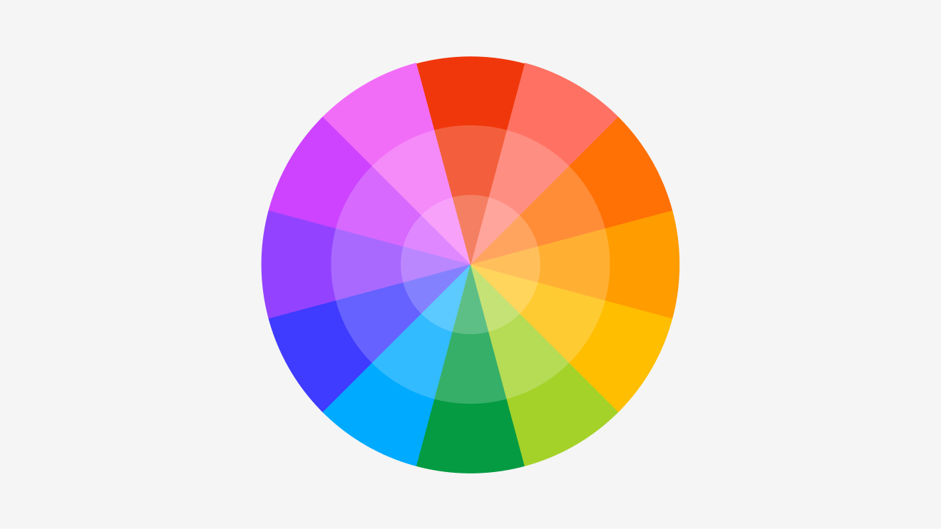
What are the primary colors (RYB)
Primary colors in the RYB color model are red, yellow, and blue. These three colors form the basis of the color wheel and can be mixed in different proportions to create all other colors.
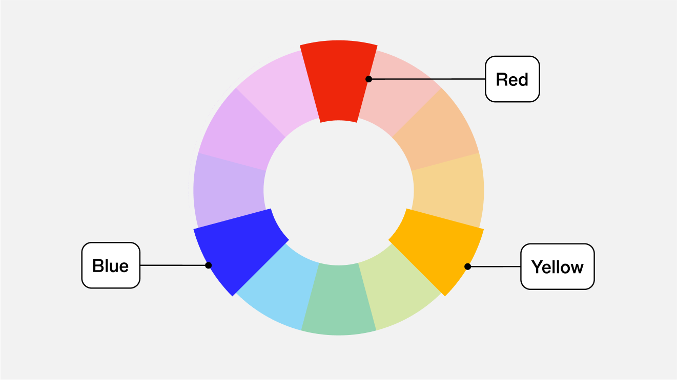
What are the secondary colors
Secondary colors hold the space between primary colors on the color wheel and are formed by blending two primary hues together. For example, mixing red and blue creates purple, while combining red and yellow makes orange. To remember how green is produced, look to the adjacent primary colors for your answer: yellow and blue.
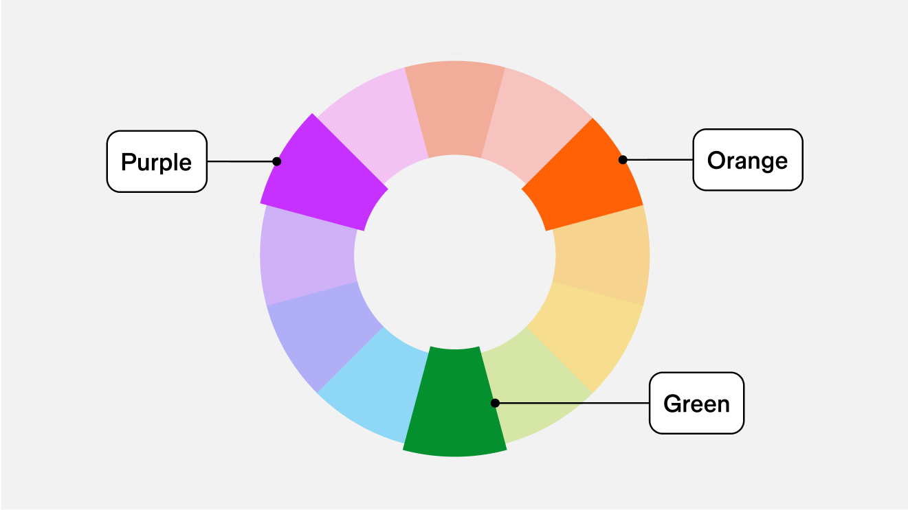
What are the tertiary colors
Filling in the rest of the wheel are the tertiary colors, or intermediate colors. You get these colors when you mix a primary and secondary color. For example, mixing red and orange gives you red-orange, and fills in the missing space between the two. With a scrollable color wheel, you can adjust to the individual shade of red-orange that you want based on your placement on the wheel. You can also mix blue-green, blue-violet, red-orange, red-violet, yellow-orange, and yellow-green to create unique tertiary colors. This granular color-picking ability helps product designers find the exact shade and accent colors they want.
Color plays a crucial role in the way a product is accessed, perceived, remembered, and differentiated from competitors. When carefully selected with a product’s context in mind—it’s audience, industry, and intended outcomes—color is a powerful tool that can effect a user's behavior.
— Chelsea White, Brand Designer, Figma
What are the seven color schemes?
Color schemes are strategic color combinations that help achieve visual balance. These schemes use color theory principles to create aesthetically pleasing designs. There are seven common types of color schemes:
Complementary Colors
Complementary colors pairs colors from opposite sides of the color wheel to create a high contrast. You’ll find the complementary color if you pick a color and then travel 180° around the color wheel. Some complementary color schemes are well known and popular, like red and green. These color schemes can be powerful if you want both warm and cool colors in your design.
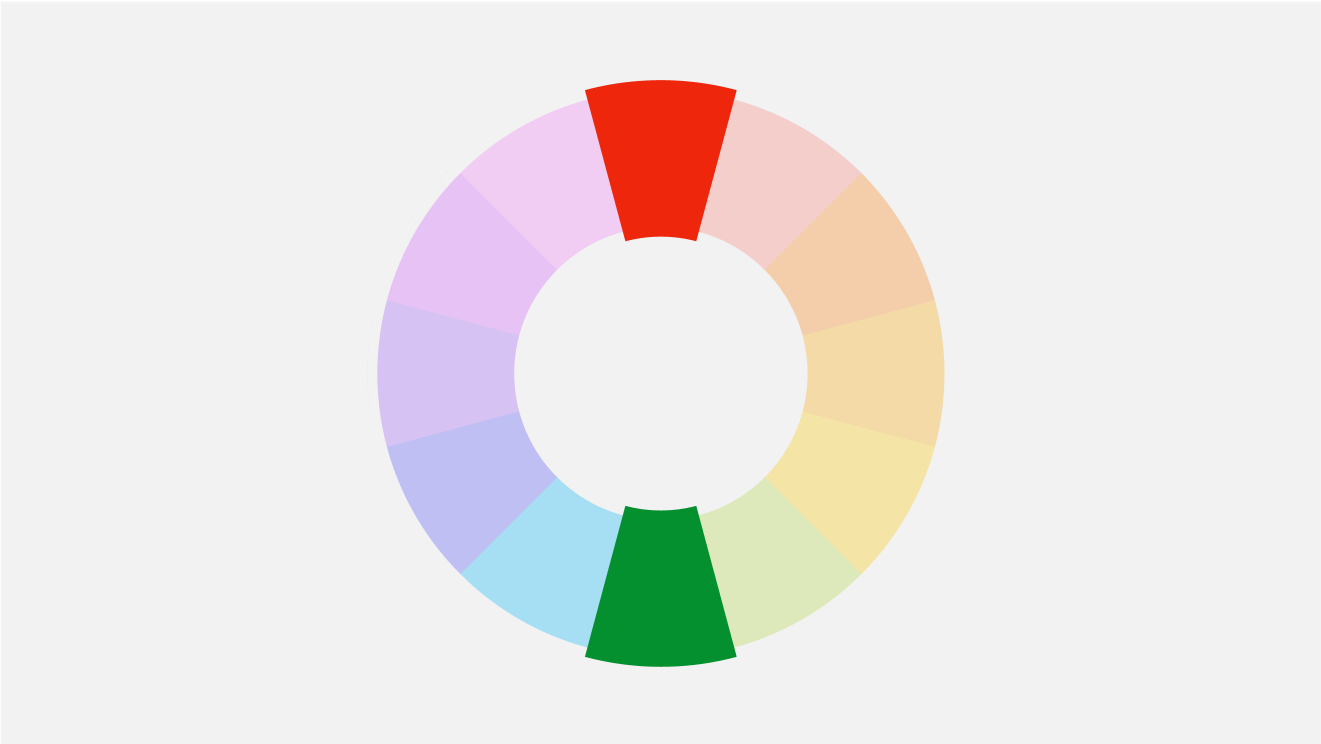
Complimentary colors for #693EFE
Complementary
Split Complementary Colors
Split complementary colors are color combinations in which you combine a base color with the two adjacent tertiary colors on either side of the color. This gives you a palette of three colors and helps to create a more subtle color palette.
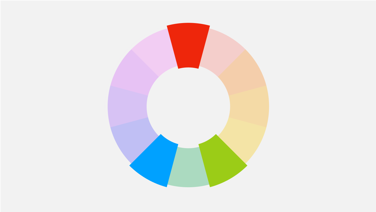
Split complimentary colors for #693EFE
Split
Monochromatic Colors
Monochromatic colors are probably the easiest to wrap your head around because they’re just a lighter and darker version of your primary color. A monochromatic color scheme removes the decision-making complexity around using several contrasting colors and generally allows designers to use color effectively in a subtle way. To make a monochromatic color palette, you scale the lighter and darker versions the same amount from your primary color.
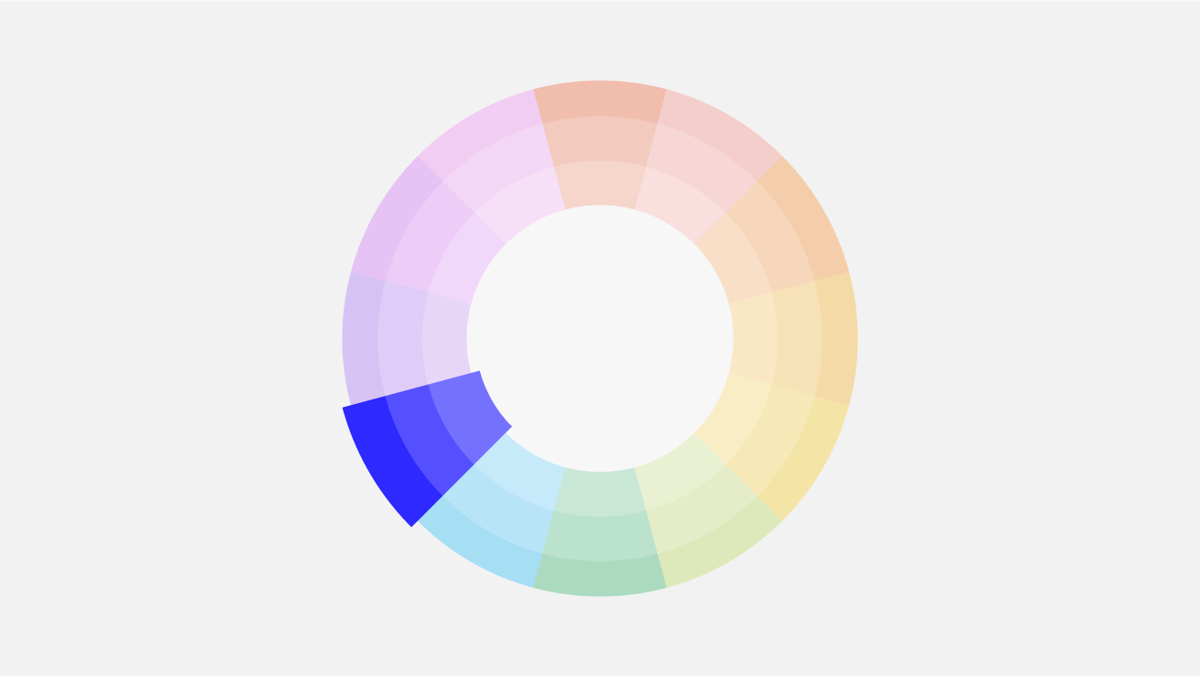
Monochromatic colors for #693EFE
Monochromatic
Analogous
Analogous colors are groups of three colors that sit adjacent on the color wheel. It creates a softer, more natural color palette. Nature, after all, has lots of closely related hues. Just think about leaves on a tree, or the subtle differences in the color of the ocean. An analogous color scheme is quite harmonious and can help tie different elements together in a design.
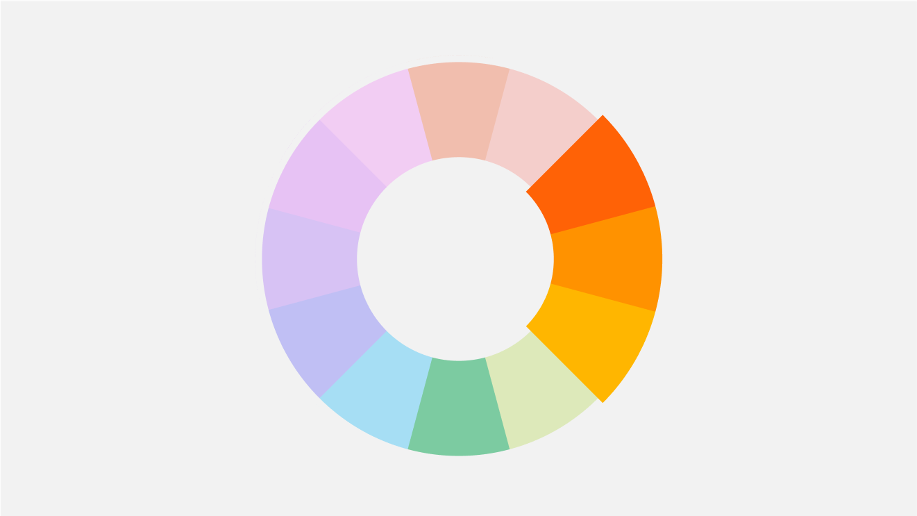
Analogous colors for #693EFE
Analogous
Triadic
A triadic color scheme gives you three equally contrasting colors. The points are equally distributed around the color wheel, forming an equilateral triangle. It’s best to pick a single primary color and use the other two as accents when designing with a triadic color scheme. Triadic color schemes tend to be more bold and playful.
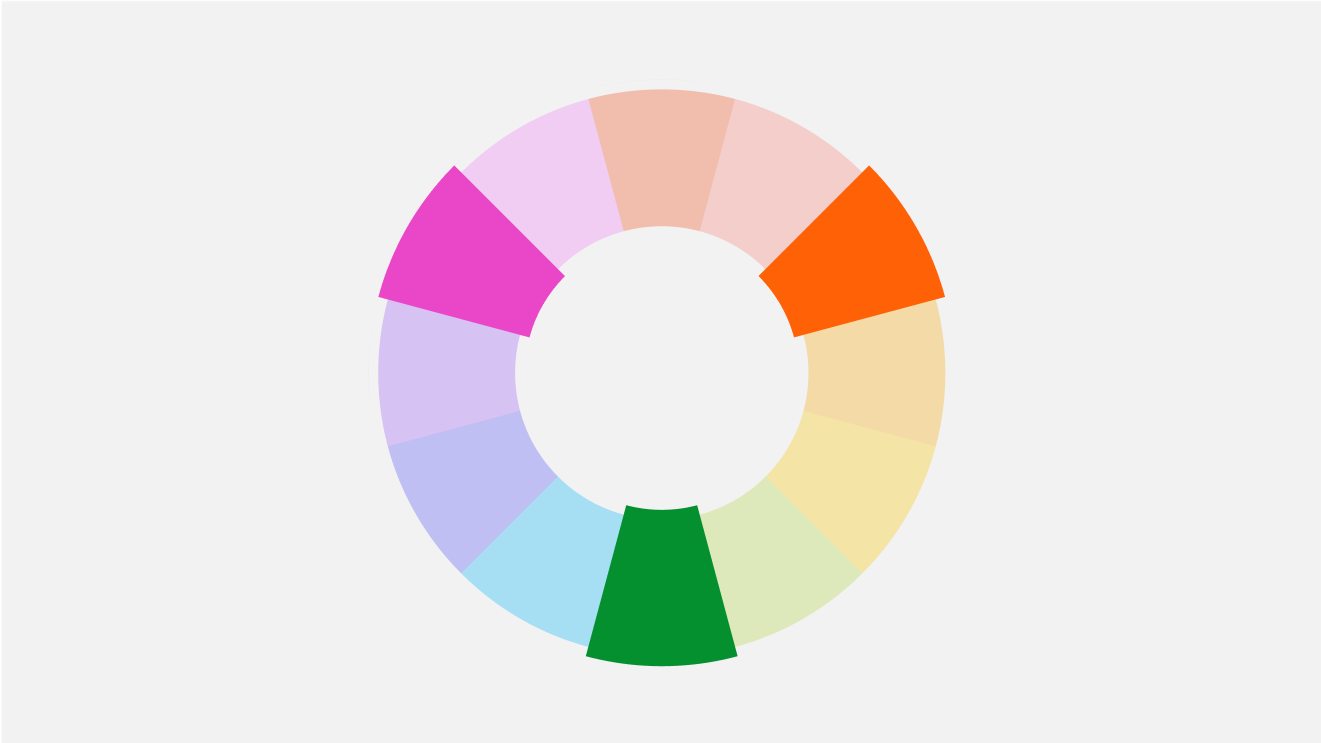
Triadic colors for #693EFE
Triadic
Tetradic (double complementray)
What do Google and Microsoft have in common? They both use tetradic color palettes for their logos. Tetradic means relates to a group of four, so in this case, we’re using the color wheel to select four colors that form a rectangle. These colors include two sets of complementary colors, creating a vibrant and energetic palette. A tetradic color scheme is sometimes called a ‘double complementary’ scheme.
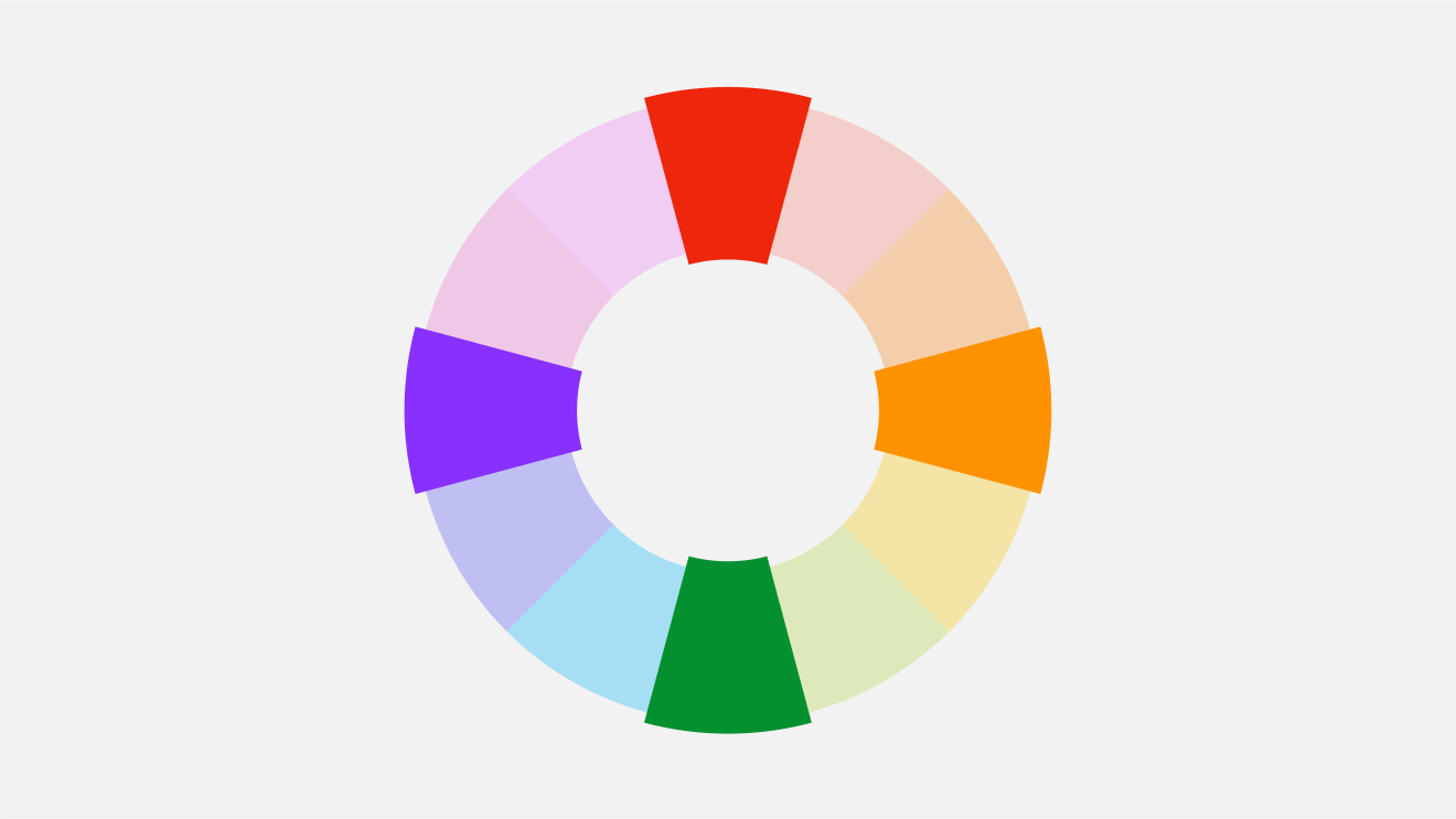
Tetradic colors for #693EFE
Square
Square
Similar to tetradic, a square color scheme uses four colors, but in this example, they are spaced evenly around the color wheel, forming a square. This creates a more balanced look compared to the high contrast of tetradic schemes. Like tetradic color schemes, it's best to choose one dominant color and use the others as accents.
Warm colors vs cool colors
The color wheel distinguishes between warm and cool hues. Warm colors convey intensity, such as red, orange, and yellow. Cool tones like purple, blue, and green evoke feelings of calmness and relaxation. Notice how the meditation app Calm primarily uses the color blue? It’s intentionally chosen to evoke a sense of peace.
A color model is a system that helps represent colors using numerical values. The four color models used on this page are:
- Red, green and blue (RGB)
- Cyan, magenta, yellow, and key (CMYK)
- Hue, saturation and lightness (HSL)
- Hexidecimal codes
Red, green, blue (RGB)
The red, green, blue (RGB) color model is the foundation for any design displayed on a screen. This color model's roots are based on human perception of colors and how our eyes interact with light. These ‘additive colors’ can be mixed into the array of colors that we interact with on our screens every day.
Cyan, magenta, yellow, and key (CMYK)
On the other hand, the CMYK model is the foundation for all print design. These ‘subtractive colors’ absorb wavelengths of light, which more clearly match the pigments found in the real world.
- Cyan (C): Cyan is a bluish-green color. When cyan ink is applied to a surface, it absorbs red light, making it appear blue-green to the human eye.
- Magenta (M): Magenta is a purplish-red color. It absorbs green light, leading to the perception of a reddish-purplish hue.
- Yellow (Y): Yellow absorbs blue light, resulting in a yellowish color when printed.
- Key (K) or Black: The "K" in CMYK represents "Key," which refers to the black component. Black ink is used to enhance the depth and contrast of images and text. Additionally, using black ink helps prevent the muddying of colors that can occur when attempting to create black by combining colors.
Hue, Saturation and Lightness
Hue represents the colors seen on the color wheel. Think of it as a spectrum within a 360-degree circle. As you navigate around this circle, you encounter different hues.
- Color Hue: The definition of hue is complex, but at its core, it refers to the colors you see on the color wheel. The color wheel is a 360-degree circle, and you can find different hues as you travel around the circle.
- Saturation: The vibrancy or intensity of a hue, known as saturation, reflects its richness and purity. At the outside of the color wheel, you can see a hue at full saturation. As you travel towards the center of the circle, the hue becomes less intense. To bring down the hues intensity, we mix in black and white (i.e. grey).
- Lightness: Lightness determines how much black or white we mix into a color. You can get pastel colors by mixing in more white, and a deeper, darker palette by mixing in more black.
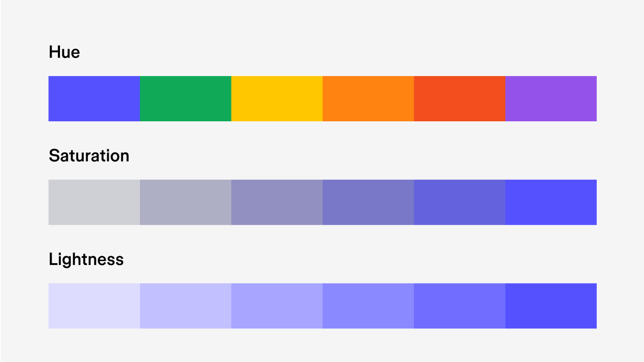
Shades and Tints for #693EFE
Shades
Tints
Hexidecimal codes
Hexadecimal (often misspelled as “Hexidecimal”) codes, or hex codes, tell your computer how much red, green, and blue to mix to produce the color of a pixel on your screen.
Each pixel on your screen is made of three color elements that produce red, green, and blue light. These color elements (called subpixels), are so small that they appear as a single color to the human eye.
Mixing different amounts of red, green, and blue light each pixel can display up to 16 million colors, which is beyond what the human eye can see.
Each pixel can mix 256 red values, 256 green values, and 256 blue values to generate 16 million color possibilities. (Multiply 256 x 256 x 256, and you get more than 16 million.) Computers send these values to each pixel using binary code, a language comprised of 1s and 0s. For instance, a red value of 200 would be represented as 11001000 in binary code. Since binary code is incomprehensible to humans, the hexadecimal system is employed as a readable alternative.
How does the hex code work?
A hex code has three values—one for red, green, and blue, each represented by two digits. For example, #F234A2 consists of:
- red: F2
- green: 34
- blue: A2
What’s the deal with the letters? Unlike our usual base-10 system, Hexadecimal counting uses base-16. It goes from 0 to 9, then, to represent numbers from 10 to 15, it uses A to F.
How to convert between hex codes and RGB
Since hex codes and HSL values are just different ways of representing the RGB color model, you can convert between them. Converting a hex code into an RGB value isn’t something you do by hand very often, but there’s some quick math to do it. For each of the three values:
- Take the first number (or letter) and multiply it by 16
- Add the second number (or letter)
For #E234A2, the first value is E2. It represents the number 226 ( 14 * 16 + 2 ). This number is the RGB value for the color red. And #E234A2 has the following RGB values:
- red: 226
- green: 49
- blue: 152
(You can also convert hex codes or RGB values into HSL values, but the math gets a bit more complicated!)
Color profiles in digital design: sRGB and P3
Various devices, monitors, browsers, and applications use diverse technologies for color rendering, which can result in visual disparities across devices. When designing for digital platforms, it's crucial to consider color profiles, as they establish a consistent standard for defining and rendering colors based on the specific screen.
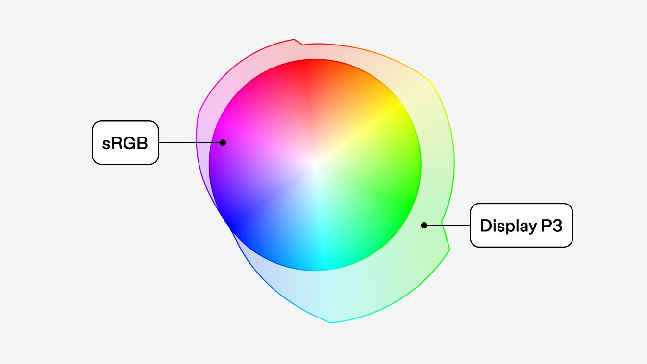
Color profiles in digital design, like sRGB and P3, ensure consistent color rendering across devices. sRGB has been the web standard for decades for content creators and web designers, ensuring visual consistency across most consumer devices. Display P3, often abbreviated as P3, can render a spectrum of colors with heightened vibrancy, depicting 49% more distinguishable colors than sRGB. However, using P3 on devices like smartphones or laptops designed for sRGB might lead to excessive energy consumption since the device needs to work harder to render the extended color range. If you are designing for platforms like iOS or high-definition/retina screens, Display P3 is the best choice, but not all applications and software fully supports its wider color range.
Learn how Figma supports P3 color profiles here.
WCAG and color accessibility
In 1999, the first version of Web Content Accessibility Guidelines (WCAG) was published by the World Wide Web Consortium (W3C). This technical document ensures web content is accessible to all users. Recognized as the world standard for web accessibility, the W3C's recommendations hold significant sway within the web development and digital design communities. The organization publishes ongoing updates to reflect technological advancements and emerging accessibility needs.
The current document, WCAG 2.1, expands web accessibility guidelines by addressing a wider range of disabilities, including cognitive impairments and mobile device usage, creating a more inclusive web experience. One critical aspect covered in the guidelines is visual accessibility, particularly the importance of contrast in color design. Proper contrast ensures that text and interactive elements stand out against background colors, essential for users who have visual impairments like color blindness or low vision.
WCAG recommendations specify minimum contrast ratios for text and images of text to ensure that all users, regardless of their visual capabilities, can access information. For example, a minimum contrast ratio of 4.5:1 is recommended for normal text. Larger text must have a ratio of at least 3:1.
WCAG 3.0 is currently in development and promises to be even more comprehensive. More nuanced guidelines for color contrast are expected to be introduced, among other enhancements.
Accessibility for #693EFE
- Large Text
Figma
- Normal Text
How you design, align, and build matters. Do it together with Figma.
5.64:1
WCAG 2.2 Simple Contrast
Normal Text
- Pass
- AA
- 4.5:1
- Fail
- AAA
- 7:1
Large Text
- Pass
- AA
- 3:1
- Pass
- AAA
- 4.5:1
- Large Text
Figma
- Normal Text
How you design, align, and build matters. Do it together with Figma.
3.72:1
WCAG 2.2 Simple Contrast
Normal Text
- Fail
- AA
- 4.5:1
- Fail
- AAA
- 7:1
Large Text
- Pass
- AA
- 3:1
- Fail
- AAA
- 4.5:1
Color simulations for #693EFE
Protanopia
Deuteranopia
Tritanopia
Achromatopsia
Bring it to life with Figma
Jumpstart your designs with your very own custom color palette.
Keep exploring
Image color picker
Create custom color palettes from any image with our color picker
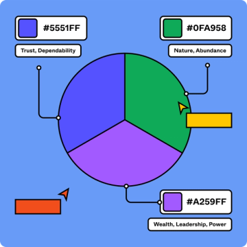
What is color theory?
Color theory helps designers make color choices that captivate users and elevate a brand.

UI design
Learn the ins and outs of the user interface design process.

