Page layout

Page layout is a part of typography and graphic design. It deals with the arrangement and style of elements (content) on a page.
History and development
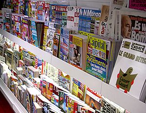
[change | change source]Page design has long been a consideration in printed material. It began with early illuminated manuscripts in the hand-copied books of the Middle Ages. Today, modern magazine and catalogue layouts, (and other print media) consist of type (text), images (pictures), and occasionally place-holder graphics for elements that are not printed with ink such as die/laser cutting, foil stamping or blind embossing.
Since the advent of computing, page layout skills are used on electronic media as well as print. The electronic page–the graphical user interface (GUI)–is often where design now takes place.[1]
A page layout may be designed in a rough paper and pencil sketch before producing, or produced during the design process to the final form. Both design and production may be achieved using hand tools or page layout software. Producing a web page may require knowledge of markup languages along with WYSIWYG software. Special considerations must be made for how the layout of an HTML page will change (reflow) when resized by the end-user.[2] Cascading style sheets are often required to keep the page layout consistent between web browsers.
Grids versus templates
[change | change source]Grids and templates are page layout design patterns used in advertising campaigns and multiple-page publications, including websites.
- A grid is a set of guidelines. These can be seen by the designer, but are invisible to the end-user. Their function is to align and repeatelements on a page. A page layout may or may not stay within those guidelines, depending on how much repetition or variety the design style in the series calls for. Grids are meant to be flexible. Using a grid to lay out elements on the page may require just as much or more graphic design skill than that which was required to design the grid.
- In contrast, a template is more rigid. A template involves repeated elements mostly visible to the end-user/audience. Using a template to lay out elements usually involves less graphic design skill than that which was required to design the template. Templates are used for minimal modification of background elements and frequent modification (or swapping) of foreground content.
Most desktop publishing software allows for grids in the form of a page filled with coloured lines or dots placed at a specified equal horizontal and vertical distance apart. Automatic margins and booklet spine (gutter) lines may be specified for global use throughout the document. Multiple additional horizontal and vertical lines may be placed at any point on the page. Invisible to the end-user/audience shapes may be placed on the page as guidelines for page layout and print processing as well. Software templates are achieved by duplicating a template data file, or with master page features in a multiple-page document. Master pages may include both grid elements and template elements such as header and footer elements, automatic page numbering, and automatic table of contents features.
Front-end versus back-end
[change | change source]With modern media content retrieval and output technology, there is much overlap between visual communications (front-end) and information technology (back-end). Large print publications (thick books, especially instructional in nature) and electronic pages (web pages) require meta data for automatic indexing, automatic reformatting, database publishing, dynamic page display and end-user interactivity. Much of the meta data (meta tags) must be hand coded or specified during the page layout process. This divides the task of page layout between artists and engineers, or tasks the artist/engineer to do both.
More complex projects may require two separate designs: page layout design as the front-end, and function coding as the back-end. In this case, the front-end may be designed using an alternative page layout technology such as image editing software or on paper with hand rendering methods. Most image editing software includes features for converting a page layout for use in a "What You See Is What You Get" (WYSIWYG) editor or features to export graphics for desktop publishing software. WYSIWYG editors and desktop publishing software allow front-end design prior to back end-coding in most cases. Interface design and database publishing may involve more technical knowledge or collaboration with information technology engineering in the front-end.
References
[change | change source]- ↑ Gottschall, Edward M. 1989. Typographic communications today. MIT Press, Cambridge, Mass. and London. ISBN 0-262-07114-2
- ↑ End-user: reader sitting in front of a personal computer or web-linked phone; or, reader with printed material.

