iBet uBet web content aggregator. Adding the entire web to your favor.


Link to original content: https://phabricator.wikimedia.org/T306283
⚓ T306283 [SPIKE] Review suite of WMDE template dialog changes before widespread deployment
Page MenuHomePhabricator

[SPIKE] Review suite of WMDE template dialog changes before widespread deployment
Closed, ResolvedPublic

Assigned To
Authored By
ppelberg
Apr 15 2022, 11:38 PM
Referenced Files
F35063748: image.png
Apr 22 2022, 9:58 PM
F35063669: image.png
Apr 22 2022, 9:58 PM
F35063684: image.png
Apr 22 2022, 9:58 PM
F35063655: image.png
Apr 22 2022, 9:58 PM
F35063262: Screen Shot 2022-04-22 at 1.31.20 PM.png
Apr 22 2022, 9:03 PM
F35063261: Screen Shot 2022-04-22 at 1.31.16 PM.png
Apr 22 2022, 9:03 PM
F35063249: Screen Shot 2022-04-22 at 1.35.46 PM.png
Apr 22 2022, 9:03 PM
F35063251: IMG_3256.PNG
Apr 22 2022, 9:03 PM

Description

This task represents the work of the Editing Team reviewing the suite of meta:Template dialog improvements and documenting any issues they think need to block WMDE from deploying these improvements to all Wikimedia wikis at the end of April.

Timing

Any blockers ought to be named by Friday, 22 April 2022.

Blocking issues

If the Editing Team identifies any blockers, they will be documented in this section.

The Editing Team did NOT identify any issues they thought ought to block the wider deployments WMDE is planning for

More context can be found in T306283#7874526 and T306283#7874598.

Review Instructions

  1. The non-exhaustive list of changes WMDE is making to the template dialogs people encounter in VE can be found here: meta:Template dialog improvements .
  2. The changes named in "1." can be seen/tried in VE at any of the following projects:
    • de.wiki
    • el.wiki
    • ms.wiki
    • tw.wiki
    • fr.wiki
    • hu.wiki
    • tr.wiki
    • he.wiki
    • fi.wiki
    • en.wikivoyage
    • Nauruan Wiktionary
    • Dagbani Wikipedia
    • Group 0 wikis

Done

  • Any issues the Editing Teams sees as worthy of blocking the deployments WMDE has planned are documented in the === Blocking issues section above.

Event Timeline

@Lena_WMDE, @ECohen_WMDE, and team: the changes y'all have made to the template dialogs look great. I did NOT see any issues that I think ought to block the wider deployment y'all are planning for.

I'm assigning this task over to @Esanders to do a quick review before we consider this investigation "Complete."


In the meantime, as I was trialing the template dialog improvements, a couple of questions surfaced in my mind; I've listed them below.

Questions

QuestionScreenshot
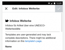
1. When adding a new parameter to a template on mobile, I noticed the browser cursor is not focused on said newly-inserted parameter as is done on desktop...is this a known issue/intentional behavior?
Screen Shot 2022-04-22 at 1.35.46 PM.png (606×1 px, 133 KB)
IMG_3256.PNG (2×1 px, 767 KB)
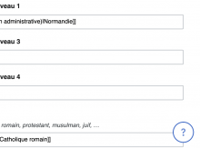
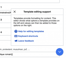
2. The floating ? button that opens the "Template editing support" dialog: is this a new element? And if so, are y'all planning for this to be present indefinitely? Is it something you are thinking this will eventually be "retired" once people have gotten used to the functionality? I ask this wondering if this an element/design pattern we need to consider in any future work we might do in template dialogs and/or in VE more broadly.
Screen Shot 2022-04-22 at 1.31.16 PM.png (704×948 px, 49 KB)
Screen Shot 2022-04-22 at 1.31.20 PM.png (780×882 px, 98 KB)

As with Peter, I didn't find anything I think is a blocker, and the new experience is a great improvement.

1
The validation behaviour seems a little strange. One of the fields in the infobox on https://de.wikipedia.org/wiki/Angkor?veaction=edit is an external URL. If I entered something invalid, the field turned red on blur, but no other messages were shown. I know the validation is "weak" in that invalid inputs should still be allowed, but could there be stronger messaging (like the warning for empty required fields)?
After setting a non-URL and re-opening the dialog, the field lost the external link icon styling, is this intentional?

image.png (131×582 px, 18 KB)
image.png (142×577 px, 15 KB)

2
Small note, in this message:

image.png (76×587 px, 13 KB)

we moved away from using the "brand name" VisualEditor, and instead try to refer to it as "the visual editor".

3
On mobile, the padding above the form is much larger than the horizontal padding, which looks odd.

image.png (346×444 px, 34 KB)

Thanks @ppelberg and @Esanders for the review and useful feedback. I will respond to the questions in order, and we will look into fixing the minor issues raised by Ed (2 & 3) in follow up tickets. Regarding spacing on mobile - we're planning to fine tune that in general so any other inconsistencies should be improved as well.

  1. When adding a new parameter to a template on mobile, I noticed the browser cursor is not focused on said newly-inserted parameter as is done on desktop...is this a known issue/intentional behavior?

This is intended behavior. The auto-focus on mobile opens the mobile "keyboard" and it would hide the sidebar, which causes a disruption in the workflow to add parameters that we assessed to be more harmful than useful. This is also the existing behavior on mobile.

  1. The floating ? button that opens the "Template editing support" dialog: is this a new element? And if so, are y'all planning for this to be present indefinitely? Is it something you are thinking this will eventually be "retired" once people have gotten used to the functionality? I ask this wondering if this an element/design pattern we need to consider in any future work we might do in template dialogs and/or in VE more broadly.

The intention is for this button the remain, as it includes the link to the keyboard shortcuts and help documentation for using the template dialog. We will likely remove the first link, to provide feedback, after some period of time. This element was actually introduced by the Growth team and we adapted it for our purposes.

1 The validation behaviour seems a little strange. One of the fields in the infobox on https://de.wikipedia.org/wiki/Angkor?veaction=edit is an external URL. If I entered something invalid, the field turned red on blur, but no other messages were shown. I know the validation is "weak" in that invalid inputs should still be allowed, but could there be stronger messaging (like the warning for empty required fields)? After setting a non-URL and re-opening the dialog, the field lost the external link icon styling, is this intentional?

Validation is a tricky topic. We initially prototyped introducing additional error messages, but testing showed that because errors are so diverse and specific, it was neither possible to either implement messages for all specific errors, nor implement general messages that helped rather than confused, and implementing error messages/validation for some inputs but not all resulted in users expecting the dialog to be "smarter" than it is (i.e. turned into an expectation that all fields are validated). In the end, we didn't touch this in production. It looks like this is an existing issue and I don't think we'll have time to look into it.

Change 786950 had a related patch set uploaded (by Awight; author: Awight):

[mediawiki/extensions/VisualEditor@master] Use natural language rather than the brand name

https://gerrit.wikimedia.org/r/786950

Validation is a tricky topic. We initially prototyped introducing additional error messages, but testing showed that because errors are so diverse and specific, it was neither possible to either implement messages for all specific errors, nor implement general messages that helped rather than confused, and implementing error messages/validation for some inputs but not all resulted in users expecting the dialog to be "smarter" than it is (i.e. turned into an expectation that all fields are validated). In the end, we didn't touch this in production. It looks like this is an existing issue and I don't think we'll have time to look into it.

Thanks, if you kept documentation of your findings it might be helpful to record those in a task.

Change 786950 merged by jenkins-bot:

[mediawiki/extensions/VisualEditor@master] Use natural language rather than the brand name

https://gerrit.wikimedia.org/r/786950

Thanks @ppelberg and @Esanders for the review and useful feedback.

100%

  1. When adding a new parameter to a template on mobile, I noticed the browser cursor is not focused on said newly-inserted parameter as is done on desktop...is this a known issue/intentional behavior?

This is intended behavior. The auto-focus on mobile opens the mobile "keyboard" and it would hide the sidebar, which causes a disruption in the workflow to add parameters that we assessed to be more harmful than useful. This is also the existing behavior on mobile.

Gotcha, okay. Thank you for explaining this.

  1. The floating ? button that opens the "Template editing support" dialog: is this a new element? And if so, are y'all planning for this to be present indefinitely? Is it something you are thinking this will eventually be "retired" once people have gotten used to the functionality? I ask this wondering if this an element/design pattern we need to consider in any future work we might do in template dialogs and/or in VE more broadly.

The intention is for this button the remain, as it includes the link to the keyboard shortcuts and help documentation for using the template dialog. We will likely remove the first link, to provide feedback, after some period of time. This element was actually introduced by the Growth team and we adapted it for our purposes.

Understood. We'll keep it in mind.