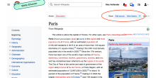
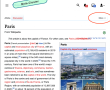
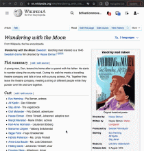
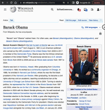
Both legacy vector and vector 2022 use the collapsibleTabs.js plugin to animate the tabs to different positions at smaller viewport widths and when the tabs would otherwise overlap:
The animation causes our visual regression tests to wait 1.5 seconds before taking a snapshot which slows down the tests and the animation can be relatively buggy.
The use of JavaScript and animating the tabs also means that the UI is unpredictable, for example if the history label is longer in German than English Wikipedia, the history icon will move to the more menu at a different resolution.
This ticket proposes that we eliminate the code from modern Vector and use CSS breakpoints to make the decision about when to collapse. This will make the UI more predictable at different breakpoints, and will reduce our UI complexity and associated risk of UI regressions across projects
Acceptance Criteria
- Animation code continues to work in legacy Vector
- In modern Vector, we will use a CSS only solution. Menu items will collapse into the more (pcactions) dropdown similar to the user menu at lower resolutions
- In modern Vector, gadgets will not collapse into the more menu automatically. Gadgets will need to explicitly add them to the more menu with the collapsing class if this behaviour is needed.
- In modern Vector, gadgets added to the p-views menu when there is no available space will instead be added to the more dropdown
QA steps
Scenario 1
Go to a page where the more menu is hidden. Edit tab is present. Resize browser to 700px
Expected: a more menu should be displayed. Clicking more button should reveal the edit tab
Scenario 2
Go to a page where the more menu is displayed (you may need an account with admin rights). Edit tab should be present on page load.
- Click more button to reveal admin action e.g. move / delete
- Resize browser to 700px.
Expected: The edit button should jump from the tabs into the more menu.
QA Results - Prod
| AC | Status | Details |
|---|---|---|
| 1 | ✅ | T306229#7926194 |
| 2 | ✅ | T306229#7926194 |


