Clines, clusters, and the effect of study design on the inference of human population structure
- PMID: 16355252
- PMCID: PMC1310579
- DOI: 10.1371/journal.pgen.0010070
Clines, clusters, and the effect of study design on the inference of human population structure
Abstract
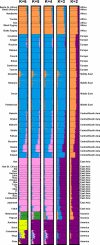
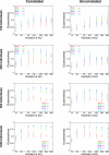
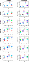
Previously, we observed that without using prior information about individual sampling locations, a clustering algorithm applied to multilocus genotypes from worldwide human populations produced genetic clusters largely coincident with major geographic regions. It has been argued, however, that the degree of clustering is diminished by use of samples with greater uniformity in geographic distribution, and that the clusters we identified were a consequence of uneven sampling along genetic clines. Expanding our earlier dataset from 377 to 993 markers, we systematically examine the influence of several study design variables--sample size, number of loci, number of clusters, assumptions about correlations in allele frequencies across populations, and the geographic dispersion of the sample--on the "clusteredness" of individuals. With all other variables held constant, geographic dispersion is seen to have comparatively little effect on the degree of clustering. Examination of the relationship between genetic and geographic distance supports a view in which the clusters arise not as an artifact of the sampling scheme, but from small discontinuous jumps in genetic distance for most population pairs on opposite sides of geographic barriers, in comparison with genetic distance for pairs on the same side. Thus, analysis of the 993-locus dataset corroborates our earlier results: if enough markers are used with a sufficiently large worldwide sample, individuals can be partitioned into genetic clusters that match major geographic subdivisions of the globe, with some individuals from intermediate geographic locations having mixed membership in the clusters that correspond to neighboring regions.
Conflict of interest statement
Competing interests. The authors have declared that no competing interests exist.
Figures


Similar articles
-
Human loci involved in drug biotransformation: worldwide genetic variation, population structure, and pharmacogenetic implications.Hum Genet. 2013 May;132(5):563-77. doi: 10.1007/s00439-013-1268-5. Epub 2013 Jan 26. Hum Genet. 2013. PMID: 23354977
-
Genetic structure of human populations.Science. 2002 Dec 20;298(5602):2381-5. doi: 10.1126/science.1078311. Science. 2002. PMID: 12493913
-
Genomic boundaries between human populations.Hum Hered. 2006;61(1):15-21. doi: 10.1159/000091832. Epub 2006 Mar 7. Hum Hered. 2006. PMID: 16534211
-
Population structure of the Chenchu and other south Indian tribal groups: relationships between genetic, anthropometric, dermatoglyphic, geographic, and linguistic distances.Hum Biol. 1994 Oct;66(5):865-84. Hum Biol. 1994. PMID: 8001914 Review.
-
Going the distance: human population genetics in a clinal world.Trends Genet. 2007 Sep;23(9):432-9. doi: 10.1016/j.tig.2007.07.002. Epub 2007 Jul 25. Trends Genet. 2007. PMID: 17655965 Review.
Cited by
-
Analysis of Gyimes Csango population samples on a high-resolution genome-wide basis.BMC Genomics. 2024 Oct 7;25(1):942. doi: 10.1186/s12864-024-10833-x. BMC Genomics. 2024. PMID: 39375616 Free PMC article.
-
Population genetics meets ecology: a guide to individual-based simulations in continuous landscapes.bioRxiv [Preprint]. 2024 Jul 24:2024.07.24.604988. doi: 10.1101/2024.07.24.604988. bioRxiv. 2024. PMID: 39091875 Free PMC article. Preprint.
-
Genome-wide association study reveals marker-trait associations for major agronomic traits in proso millet (Panicum miliaceum L.).Planta. 2024 Jul 4;260(2):44. doi: 10.1007/s00425-024-04465-4. Planta. 2024. PMID: 38963439
-
Estimating scale-specific and localized spatial patterns in allele frequency.Genetics. 2024 Jul 8;227(3):iyae082. doi: 10.1093/genetics/iyae082. Genetics. 2024. PMID: 38758968
-
Cross-cultural perception of strength, attractiveness, aggressiveness and helpfulness of Maasai male faces calibrated to handgrip strength.Sci Rep. 2024 Mar 11;14(1):5880. doi: 10.1038/s41598-024-56607-z. Sci Rep. 2024. PMID: 38467751 Free PMC article.
References
-
- Bowcock AM, Ruiz-Linares A, Tomfohrde J, Minch E, Kidd JR, et al. High resolution of human evolutionary trees with polymorphic microsatellites. Nature. 1994;368:455–457. - PubMed
-
- Rosenberg NA, Pritchard JK, Weber JL, Cann HM, Kidd KK, et al. Genetic structure of human populations. Science. 2002;298:2381–2385. - PubMed
Publication types
MeSH terms
Grants and funding
LinkOut - more resources
Full Text Sources
Other Literature Sources


